For the record, I do agree with Stanley Druckenmiller who said the other day on Bloomberg TV (or CNBC) that the Fed blew it by not tapering. It was in the market already that they would so it was a freebie.
But anyway, the market has been obsessed with tapering lately. The Fed is buying $85 billion per month in bonds; that's more than a trillion dollars a year! If you told someone 10 or 20 years ago that this would be happening, they would guess that gold would be going parabolic. But it's not.
We can't deny that if the Fed starts tapering that there will be an impact on the markets. That would be silly. Of course there will be an impact.
But the problem with these things is that we all know that. I remember back in 2011 or so when QE1 ended; the Fed stopped buying $40 billion in bonds a month and the bond market was supposed to crash. It didn't. I think it rallied sharply (a trader bragged to me he had a huge short position on for this no-brainer, lay-up trade).
Sometimes, these no-brainers are not so easy. Gold was a no-brainer too a couple of years ago when I started this blog. But it hasn't really turned out too well for gold since then. I admit it ain't over yet, though. I have no idea what will happen to gold going forward.
So What Do We Do About Tapering?
For fundamentals-based, long term investors, should we worry about the Fed? This reminds me of a CNBC clip a few years ago where someone chased after Buffett and asked him what he thinks the Fed would do that afternoon after the FOMC meeting. Buffett laughed and said something to the effect that if he based his investment decisions on what he thought the Fed was going to do, he wouldn't have done so well.
Sure, tapering has artificially reduced interest rates. I heard someone say that the Fed thinks the interest rate is 150 basis points lower than what it would be without QE3.
If interest rates pop up due to tapering, it will impact the financial markets and it will cause some volatility. Well, so what? The markets are always volatile. Most of the time it's volatile for reasons that most people don't anticipate. If you don't like volatility, you shouldn't be in the stock market. So that's not a problem.
How about the longer term impact of higher interest rates? Well, let's put it this way. If you own a business (stock) that can do well in a 1.5% interest rate environment but would be in trouble in a 5% interest rate environment, then you simply don't own a good, robust business. You shouldn't own it in the first place even with interest rates at 1.5% or 1.0%. Likewise, if the stock is cheap only because interest rates are at 1.5% but wouldn't look so cheap with interest rates at 5.0%, then maybe it's not such a great stock. Actually, if it's a good, growing business, it doesn't have to be cheap for it to be a good, solid stock to own.
If the business you own will survive a 5% interest rate environment, then who cares? Yes, the market will be volatile. Some people can't resist getting out and trying to get back in at a later date at lower prices. Most of the Financial Industrial Complex (or maybe I should call it the Financial / Media Complex) is geared to tickle those urges (and fears) to make people DO stuff.
Some people who got out of the market before the financial crisis were too scared to get in when the world was going to end. And now they are too scared to get in because of tapering and other problems. I remember last year it was the fiscal cliff. It's so hard to resist the temptation to get out before the no-brainer drop to get back in at lower prices.
It just doesn't happen that way. I'm sure we all know people who try to get in and out like that, but nobody does it well consistently. If you look at the best track records in investing, that's just not the way it has been done.
Now, if you are Stanley Druckenmiller or some other really good macro trader, that's a different story. There are guys like that who have done well trading the big swings in the market. But they too rarely get out at the top and get back in at the bottom (Druckenmiller's performance is probably not so much from getting in and out of the stock market, but more from making huge, leveraged bets in the bond and foreign exchange markets (he said so himself!), and maybe some occasional big trades in the S&P 500 index;
I doubt he calls the ups and downs of the stock markets consistently enough to be able to outperform the index just by doing that).
Debt Ceiling
This debt ceiling fear is the same. So was Syria. This is all just short term stuff that is good for macro traders, but is just irrelevant noise for the long term value investor. As even Seth Klarman said, you just have to figure out what a business can earn in five or ten years on a normalized basis and see what it's worth, and if you can buy it for lower than that (or substantially lower), then it doesn't matter what the headlines say.
So yes, despite what the pundits on TV say, I think it's OK to ignore all this stuff. Pundits on CNBC will never tell you to turn off CNBC!
Valuation
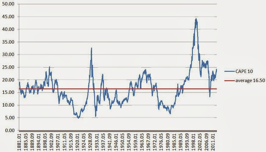
The other big fear is valuation. Commentator after commentator keeps saying that the market is overvalued, or substantially overvalued. Shiller's cyclically adjusted P/E ratio is a very popular indicator now. Here it is, direct from the Yale website:
Shiller's cyclically adjusted P/E ratio is an inflation adjusted P/E ratio. One of the key things is that it's based on the earnings of the past 10 years. This adjusts for the cyclicality in earnings; the past ten years would include good years and bad years and is more indicative of the normalized earnings power of the S&P 500. This makes sense.
And this figure is currently
24.25x versus an average of 16.5x for the whole period. That means that the stock market is currently
47% overvalued.
Yikes. I say ignore this, ignore that. But
this gets my attention (which is why I spent some time on it today; plus a post was long overdue here).
This indicator seems to be a great indicator. The peaks are 1901, 1929, 1966 and 2000. Most of these seem to be horrible years to be long term investors for sure. The current level seems to be close to the 1966 peak, and we know that the Dow peaked out at 1000 or so and didn't convincingly break above that until the 1980s.
But let's not forget the Superinvestors of Graham and Doddsville. I'll borrow a table from an old post back in 2011 (
Stocks no Good? (Superinvestors):
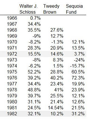
So let's time-travel back to 1966 and talk to these guys and tell them that the market is overvalued. We will tell them that they should just do something else and start their investment careers in 1979 or 1982 when the stock market will be really cheap and even idiots will put up big numbers. Not!
And these figures only go up to 1982 and the bull market hasn't even started yet!
This is what the Superinvestors essay (written by Buffett in 1984 or so) is about. They just did their thing; value investing.
For the folks now telling people to get out of stocks because of high valuation, I would like to see their historical peers. Has anyone done better than the superinvestors by getting in and out of the stock market? Did anyone really sell out in 1966, buy back in in 1982, sell out in 2000 and get back in in 2009? And even if they did would they have a better long term performance than the superinvestors?
Going back to what Buffett always says, if we think about owning stocks as owning a business rather than pieces of paper, none of this would be an issue. High stock market valuations, corporate profit to GDP or any other indicator wouldn't really matter too much.
The question would be, do you like the businesses you own? Are they well managed and priced reasonably? If yes, then who cares what some macro indicator says.
But having said all that, most of us are not superinvestors, and many people own index funds. So this valuation/chart may be directly relevant to them. The S&P 500 index is the very business that they own. And the question becomes, is it reasonably valued?
The first answer is that we have to remind ourselves that the long term performance of the stock market can only be realized by owning it throughout the whole period. The market returned 10%/year over the long term, and that includes owning it before the great crash, 1966 etc... The long term stock market return is what you earned not by getting in and out based on valuation.
I used to read a lot of newsletters (when I didn't have to pay for them; my employers had subscriptions to them all), and many had great, convincing models. When you read their stuff, it is compelling and convincing. But the fact is that none of them ever really beat the market!
Study after study show that people lose money or not do well not because they buy stocks at the peak, but because they keep trying to get in and out (if you bought stocks in August 1987, you would still be doing pretty well today, and that includes Black Monday, 1989 mini-crash, Desert Storm, Drexel, S&L crisis, banking crisis of the early 1990s, 1994 bond crash, 1997 (LTCM/Asian contagion), and two bear markets in the 2000s which included a 100-year financial crisis and 9/11).
There's a great table going around that shows prospective returns in the stock market depending on the stock market p/e ratio at the time of purchase. And it's a compelling table. It makes perfect sense. The cheaper you buy the index, the better your returns over time. The higher the price you pay, the lower the prospective returns.
And yet, I have really yet to see anyone who has put up a great track record using that simple logic. The table looks great.
But where are the Superinvestors of Convincing Tablesville?
What we are hearing from pundits is the same every time. The market was very obviously bubbled up back in 2000 but I don't really know anyone who nailed the downside; they kept trying to call the top for so long in the late 1990s that by the time the bubble finally popped, very few people were still short. Very few. Even Stanley Druckenmiller didn't play that one well (and if the greatest trader of all time didn't get that right, who are we to think we can do it better?!). I think it was similar in 2008/2009 too. It wasn't as obvious as 2000, but once the problems started happening, it was pretty obvious that the market was going to get into some trouble.
But I think very few people actually were able to make money off the short, or even get in on the lows.
No matter how compelling charts and tables look, it's just not that easy to get in and out of markets, or to make money trading it. Seriously. I've been watching people (and trying myself sometimes!) try to do it for years and most of them are better off just ignoring it all and just owning an index fund or a basket of good businesses that they like.
A Closer Look at the Shiller P/E
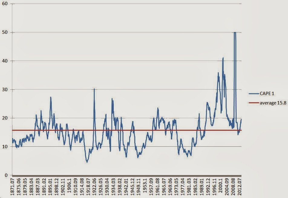
Having said all that, and having told you to ignore it all, let's take a look at this Shiller P/E ratio. I took the raw data from the Yale website to create this chart so we can see the Shiller P/E by itself.
The average for the whole period seems to be around
16.50x, and the current level is
24.25x. Now, here's the thing that has nagged me about this for a while:
- What does this chart look like if you exclude the financials? The financial crisis really distorts this figure because of the huge losses in the industry in 2008/2009.
- The 24.25x p/e ratio is supposed to represent a cyclically adjusted p/e ratio. This would be correct if we assume that the financial crisis of that magnitude is expected to occur every ten years! I highly doubt that is the case. I tend to believe (and not as an excuse for the CEOs that blew up) that it really was a once in a hundred year event. If that is that case, then the cyclically adjusted p/e ratio would be too high (and normalized 10 year earnings understated). Sure, some of that is offset by a huge credit bubble going into it; a lot of money was made during the bubble years and the 10-year p/e includes that too. But it seems like the crisis blew away a lot more than was excessively made in the bubble years of 2005-2007. I have no evidence to support that; it's just my guess and it's not a major point of this post anyway (even though I thought it might be!).

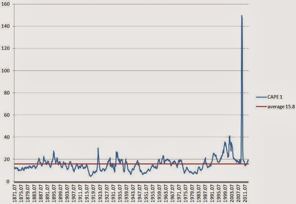
So just for fun, I decided to take a look at the non-cyclically adjusted (but inflation adjusted) p/e ratio using the same raw data:
So you can see how the p/e ratio popped up to over 140 during the crisis. I am not saying something like that won't happen again. I just doubt it is something that will happen every 10 years.
I redid the chart but capped the p/e at 50 so we can see the chart better. This doesn't effect the average; the average was calculated using the raw p/e ratio.
I call this the CAPE 1, even though it's not cyclically adjusted. The last twelve month p/e ratio is around
19.6x, so the market is certainly not cheap. The average of this raw p/e ratio over time is around
15.8x. So this seems to suggest that the market is
24% overvalued at the moment. This assumes, of course, that current earnings levels are 'normal'.
I know there is an argument that earnings are above trend due to the high margins some data show and the fiscal deficit and QE3 are pumping up the economy (and therefore corporate earnings) over normally sustainable levels. So in that sense, maybe current earnings are peak earnings levels for this cycle. In that case the market might be really overvalued.
The current 19.6x p/e looks like it overvalues the market a little bit. I know that the tables tell you that owning stocks when p/e ratios are high gives you lower returns, but just eyeballing the above chart, it doesn't look to me like the current level is necessarily "get out now!!!!"-level either.
I did looked at this wondering what the Shiller P/E would look like in the future when the big losses from the crisis suddenly drops out. It looks like it may go down a little bit, but maybe not as much as I thought as we are already at 20x p/e even if we maintain current earnings for the next ten years.
In any case, think of any investor you respect. I'll just go back to Buffett (even though he's not a good example as he is such an outlier; he would overcome a lot of headwinds!). The question becomes, would Buffett have been better off to lighten up on his holdings when the CAPE 1 is close to 20x p/e? Despite what the tables tell you, would any decent equity investor have been able to improve performance by lightening up their holdings every time this chart showed a 20x p/e? And then what level of this p/e would they have to wait for to get back in? For that matter, look at the original Shiller p/e ratio (CAPE 10) and make the same argument. Which decent value investor would have been better off by adjusting portfolio exposure according to this metric?
Tables and charts can tell elegant stories. But to actually turn that into a good performance is another matter altogether.
Conclusion
None of this is to say that the markets won't go down. It will go down. There is no doubt about that at all. The question is when, and by how much? Anyone can call a crash or a bear market. But not many will be able to exploit it.
I say ignore this and ignore that, but I only mean that in the investment sense. If you are looking at something and see a stock that is trading at 1.1x book that should be trading at 1.5x book, go ahead and buy it! Who cares what the market p/e ratio is. That's what I mean.
And it's good to be aware of these things that people talk about and are worried about. I don't advocate sticking your head in the sand. I only advocate acting rationally and resisting the urge to do stupid things (like accumulating index puts in front of a possible debt ceiling debacle, shorting treasuries in front of tapering, or lightening up on stocks because of a possible problem in Syria etc...; the problem is that you may not be the only one doing so!).
So what to do?
- If you own individual stocks, review them and make sure you like them. If you don't, or aren't sure, you'll feel horrible when it goes down 30% or 50%. And you would sell out in fear. If you really like it, you should be able to hold it through the storm and not blink. As someone said about guiding the ship by the lights from a distant lighthouse and not the waves crashing against the boat, just make sure the business will be doing well in five or ten years (and hopefully doing a lot more business). If so, sit tight.
- If you have stuff in your portfolio that is not high conviction, or even stuff you bought as a punt or on a tip, now is the time to clean house. Dump that stuff. You got lucky. Now dump that stuff while the tide is lifting all boats.
- If your portfolio went down 50% tommorow and you would be upset, then that means you own too much stock. Sell down to a level where you won't lose sleep if it went down 50% because it will at some point. OK, to say that it will happen in one day is a bit extreme. This is Joel Greenblatt's idea; the mistake people made in the financial crisis is not that they didn't sell before the crisis, but that they owned too much stock and they freaked out and had to sell in the decline out of fear. If you were comfortable with stock market volatility, you wouldn't have sold out and you would've been fine (unless of course you owned too much of the ones that went bust!).
etc...
This is the sort of thing I would advocate doing. What I would NOT advocate doing is doing something to your portfolio just because Stanley Druckenmiller said that the markets will correct when the tapering begins, or because some charts are starting to look a little scary (Shiller p/e).
I know I haven't really made the case here that the market is cheap or fairly valued or anything like that. It does seem overvalued either way you slice it. I suppose on forward earnings the market looks fairly valued, but we all know about the accuracy of analyst estimates whether top-down or bottom-up.
I was just playing with this stuff to see for myself what's going.
It's important to remember, though, that just because the market level is not cheap doesn't necessarily mean that you shouldn't own stocks! It's nice to buy stocks when the market is really cheap for sure, but that has only happened very rarely in history. Again, the 100 year performance in stocks includes holding through a 7x p/e and 30x p/e market!
If you only bought stocks when the whole market was cheap based on the Shiller p/e, you may have only bought in 1920, 1932 or 1982. If the market was at average valuation, you might hear the argument that the market doesn't bottom out until the valuation goes well below the average. In fact, I did hear that argument after 1989, 1990/1991, 1994, 1997, 2002, 2009 etc... (that the market won't bottom until the p/e gets to 7x like it did in 1932 and 1982).
You wouldn't have bought any stock since the early 1990s since the Shiller p/e would have been above the historical average (well, I am just eye-balling the above chart; the average up until the early 1990s would not have been the same as the average shown above!).
etc...
You get my point.